In the edit
Neutrals
Stone, sand and taupe appear throughout the edit as trouser partners. Neutral tones let a printed top lead and make colour look intentional rather than busy.
Women’s tops · Vile Parle West, Mumbai
Colour stories & pattern
Colour is the first emotion an outfit carries; print is its personality. This editorial looks at the colours and patterns found across the Options Mall edit — and offers general guidance on wearing them.
Part one — Colour families
Families marked “In the edit” appear in the photographs on this website. Those marked “General guidance” are offered as broader styling advice.
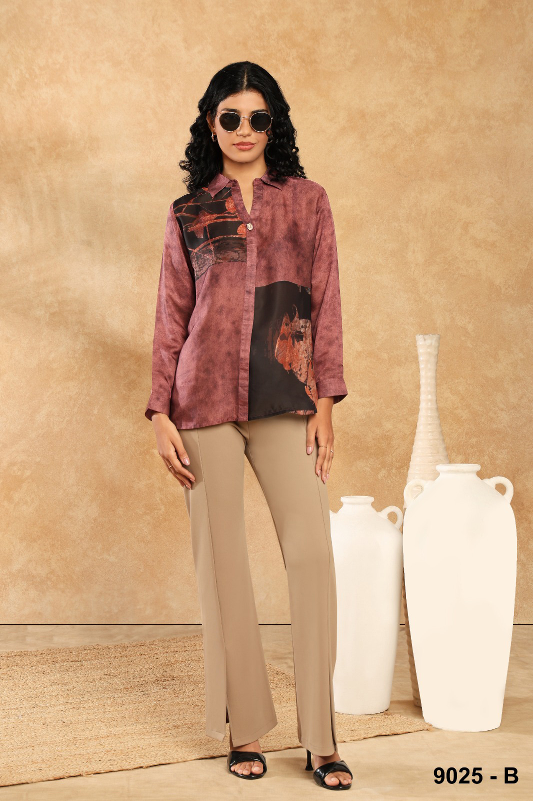
Stone, sand and taupe appear throughout the edit as trouser partners. Neutral tones let a printed top lead and make colour look intentional rather than busy.
Ivory grounds carry line prints and wraps, softening dark patterns. Cream reads warmer and softer than optical white and flatters a wide range of skin tones.
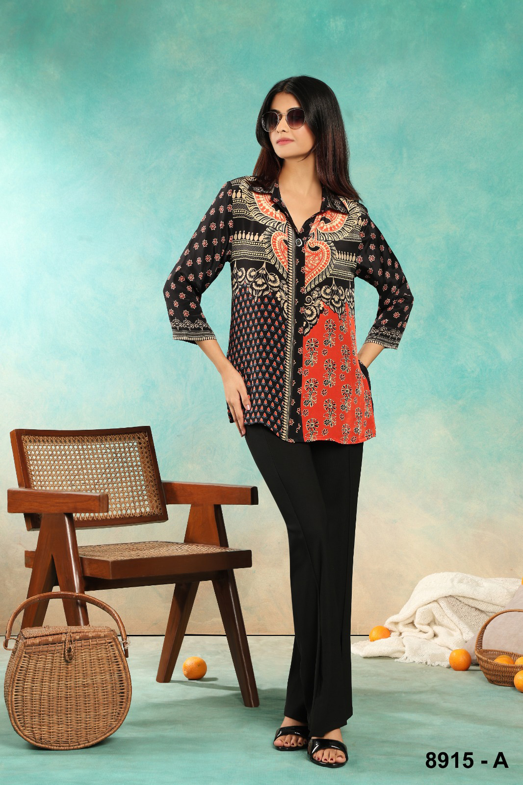
Black, charcoal and espresso ground the edit’s line florals and lily prints. Dark tops sharpen contrast with white motifs and move easily from day to evening.
Burgundy, plum and deep teal are the signature of the edit. Rich and saturated, they flatter in both daylight and lamplight and pair beautifully with gold.
Cocoa, rust, ochre and terracotta appear in textured solids and floral prints. Earth tones feel grounded and warm, and combine easily with each other.
Poppy red, orange and saffron appear as panels and flowers within prints rather than as whole garments — brightness in measured doses.
Blush, mint, lilac and butter are soft, light-reflecting colours often associated with warm-weather dressing. Try them with cream or stone for a tonal look, or with denim for contrast.
Part two — Prints & patterns
The edit is rich in pattern. These are the print families you will find across this website’s photographs.
From oversized poppies on rust to white lilies on black and line-drawn flowers on plum. Large florals feel bold and artistic; line florals feel graphic and modern.
Brushstrokes and colour fields in teal, wine and gold on a lustrous ground. Abstracts are surprisingly easy to wear because they have no obvious “direction”.
Different prints combined in blocks, as on the shirt pictured here. Contrast panels create structure on a simple shape and work best with solid trousers.
Painterly, figurative prints turn a shirt into a canvas. Keep everything else simple and let the artwork lead.
Diagonal and vertical stripes appear on wrap tops in the edit. Stripes add movement and structure; diagonal stripes follow the line of a wrap beautifully.
Small, regular motifs read almost as texture from a distance. They are the gentlest way to introduce pattern.
Monochrome zebra-like stripes behave like a neutral with energy — bold in pattern, calm in colour.
Baroque scrolls, paisleys and motifs inspired by Indian textile traditions bring richness and a sense of craft.
Print scale
Scale changes how a print behaves. Small repeats read as texture and feel refined; medium prints are lively but easy to pair; large, open motifs become the focal point of an outfit.
Part three — Coordination
The easiest way to style a printed top: choose a bottom in one of the print’s own colours, ideally a darker or more neutral one. The outfit instantly looks considered.
Pair one pattern with solids. If you want to mix prints, vary the scale (a large floral with a fine stripe) and keep at least one colour in common.
High contrast (black and ivory) looks graphic and crisp. Low contrast (cocoa and rust) looks soft and tonal. Choose the effect rather than landing on it by accident.
Black, stone, cream and cocoa trousers are not boring choices; they are frames that make a statement top look intentional.
Wearing several shades of one colour — plum with mauve, rust with cocoa — looks sophisticated and lengthens the silhouette.
None of these are rules. Some people love clashing colour; some live in black. The best palette is the one you feel most like yourself in.
| If your top is… | Easy partners | Confident partners |
|---|---|---|
| Wine / burgundy | Ivory, stone, black | Blush pink, olive, camel |
| Deep teal | Black, ivory, charcoal | Rust, mustard, chocolate |
| Rust / terracotta | Cocoa, cream, denim | Teal, olive, plum |
| Plum / mauve | Black, ecru, grey | Sage, mustard, wine |
| Black print | Black, stone, white | Red, cobalt, emerald |
| Ivory / cream | Brown, beige, navy | Terracotta, burgundy, forest green |
Seasonal colour inspiration
Mumbai’s seasons are defined less by cold than by heat, humidity and the monsoon. General ideas for each:
Lighter grounds — ivory, cream, pastels — reflect heat and look fresh. Open prints with plenty of background feel airy.
Deeper colours and busy prints are practical on wet, grey days and lift the mood. Quick-drying fabrics help.
Jewel tones, wine and gold-accented prints come into their own. A lustrous finish adds celebration.
Earthy rust, cocoa and plum layer well with light jackets and shrugs on milder evenings.